TEAM X
Designing the next-gen fraud detection system

TeamX was building an AI-driven fraud detection system to help businesses minimize losses. Their core feature assigned risk scores to entities while generating alerts based on patterns. We explored how alerts were triggered, what actions users could take, and refined the rule-based system to enhance fraud detection and prevention.
My Role
Lead UI UX Designer
Timeline
4 Months
Analysis
Context
Fraud detection systems struggle with complex rule creation and overwhelming alert data, making it hard for analysts to act quickly.
"
What we heard
from Stakeholders:
- Analyst starts their day.
- Sees alerts assigned to them.
- Opens one flagged alert.
- Thinks “Why is this even an alert?” Tries to dig deeper.
- Goes through different data points to understand the severity of the alert.
Process:
Understand
→Brainstorm &
Ideate
→Ideate
Sketch
→Build and
Ship
→Ship
Test &
Iterate
Iterate
Research - Where I started
Understanding the Market & Users
Fraud detection was a completely new domain for me. I started by interviewing stakeholders to understand how analysts work—how alerts are defined, what makes a case urgent, and where the bottlenecks lie. Alongside that, I dug into competitor products, industry docs, and market research to map the landscape and spot gaps others were missing.
Primary research:
- Stakeholder Interview
- Interview data reviews
Secondary research:
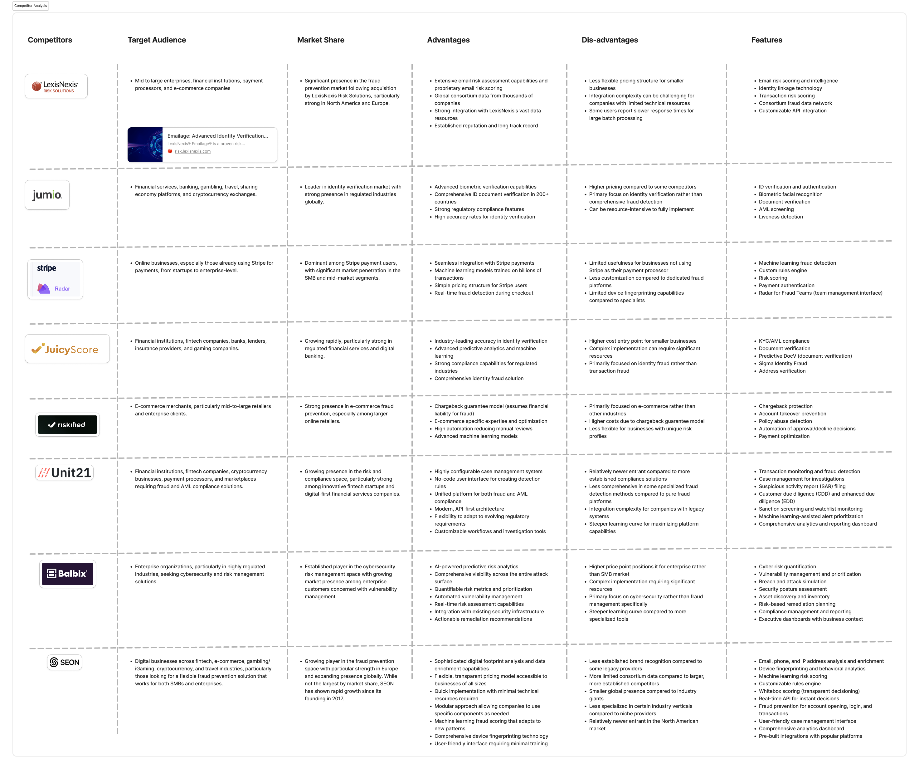
- Competitor analysis
- Product reviews & Docs
- Market Research & Industry standards
About the market and company | Competitor analysis
100%
Who is the User?
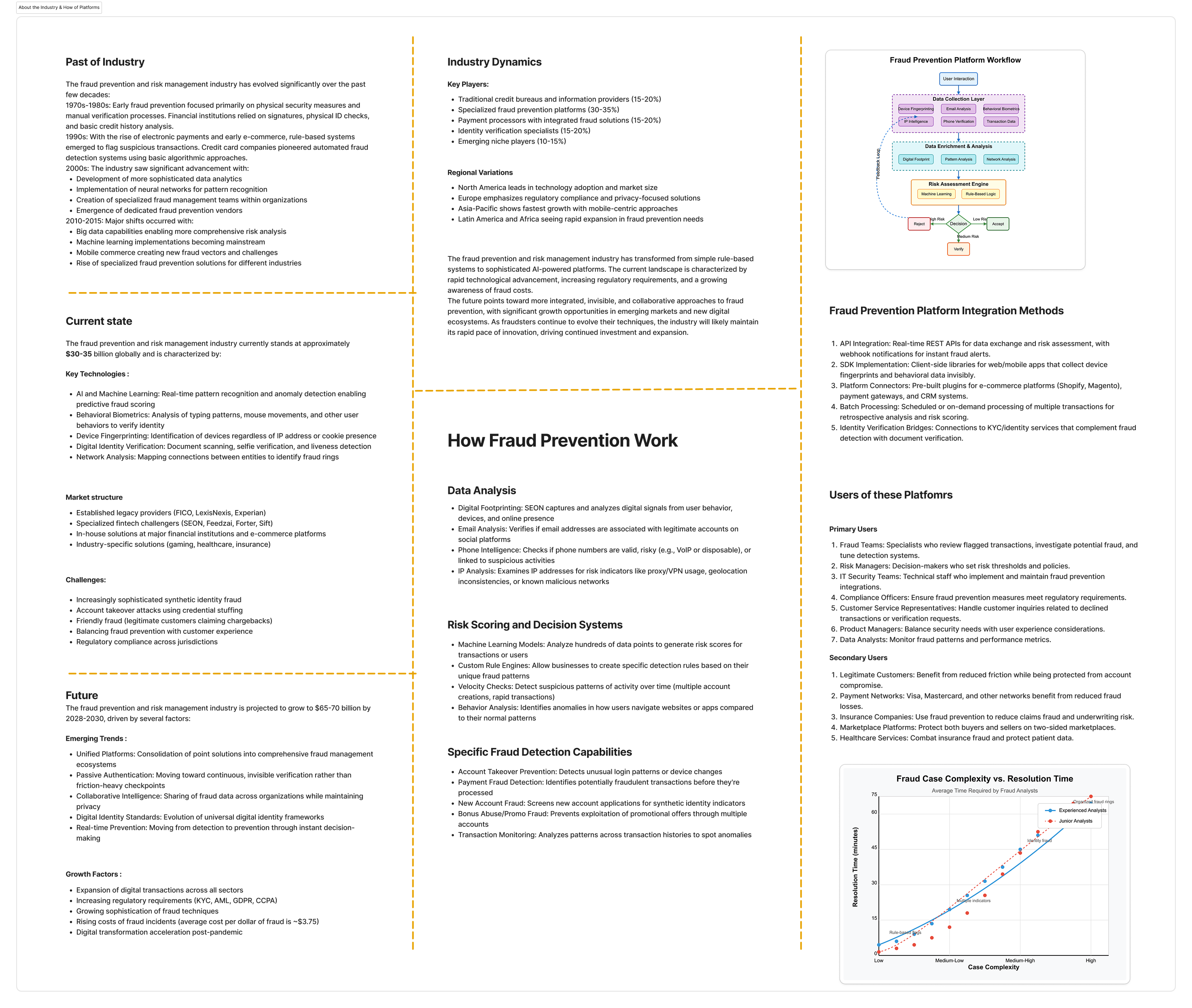
Our users are analysts in the eCommerce and banking sectors who are assigned fraud cases to investigate, assess, and take action on the associated entities.
Drag to see all Personas >>


After thorough research, we focused specifically on the alert resolution workflow within the product. We began by creating journey maps to understand this critical process in detail.
Findings
Lack of Clarity – Alert information is presented in a cluttered manner, making it difficult to extract key insights.
Unstructured Data Segmentation – Critical data points are not well-organized, leading to confusion in prioritizing alerts.
Insufficient Guidance – Users struggle to interpret alerts due to the absence of contextual explanations or actionable insights.
Information Overload – Excessive, irrelevant data makes it hard for analysts to focus on what truly matters.
Ambiguity in Decision-Making – Unclear risk indicators and lack of recommendations hinder quick and confident actions.
Problem statement
Security analysts are unable to efficiently assess and resolve alerts because they lack clear prioritisation, contextual guidance, and confidence in their decisions — leading to slower response times, missed threats, and analyst burnout.
User Flow & Wireframing
Design Experiments: From Insights to Wireframes
Fixing the Flow
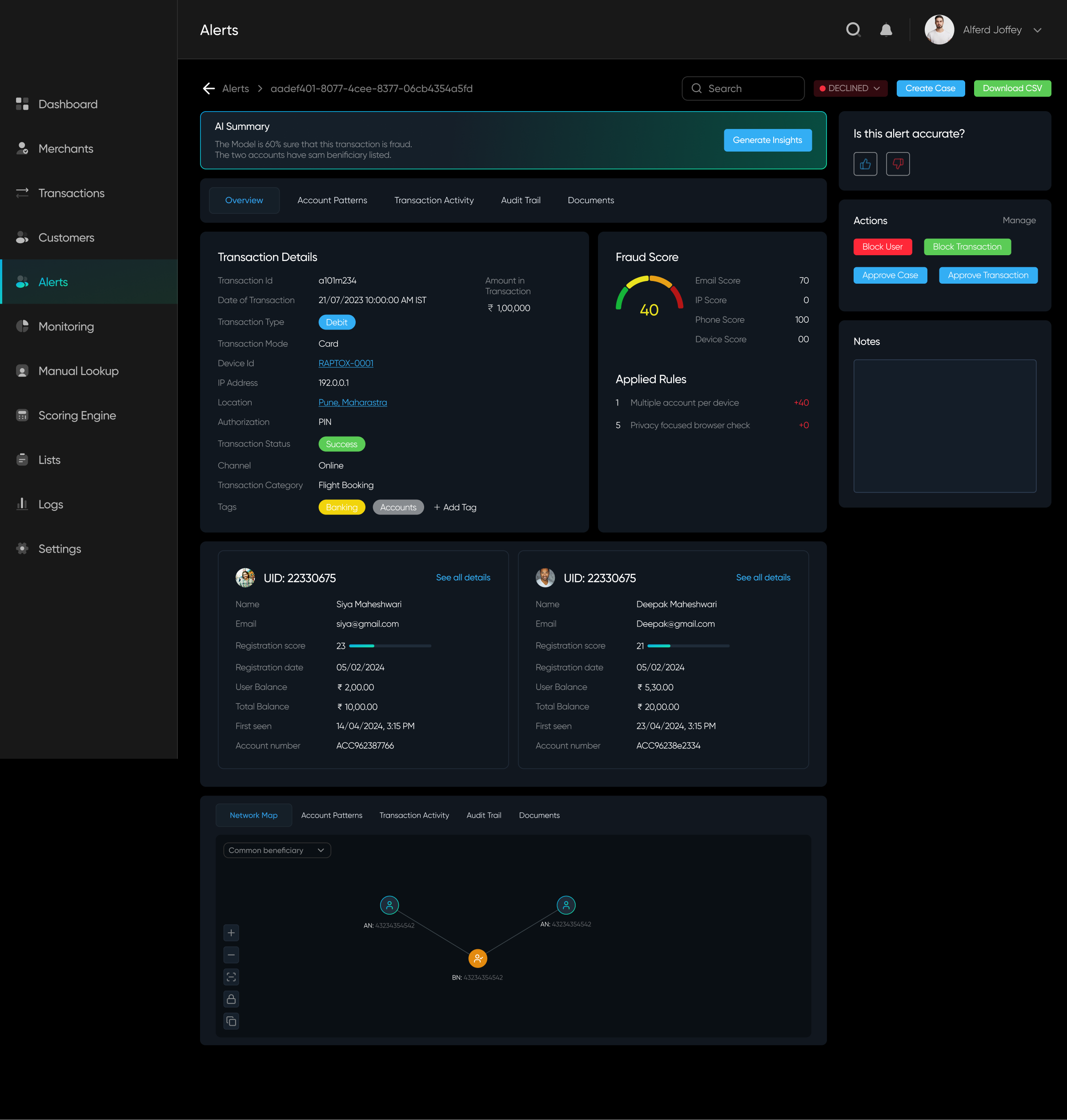
We mapped the user flow for the Alert Details page to identify obstacles and streamline the design, making the alert resolution process faster and more intuitive.

Sketching Ideas & Design
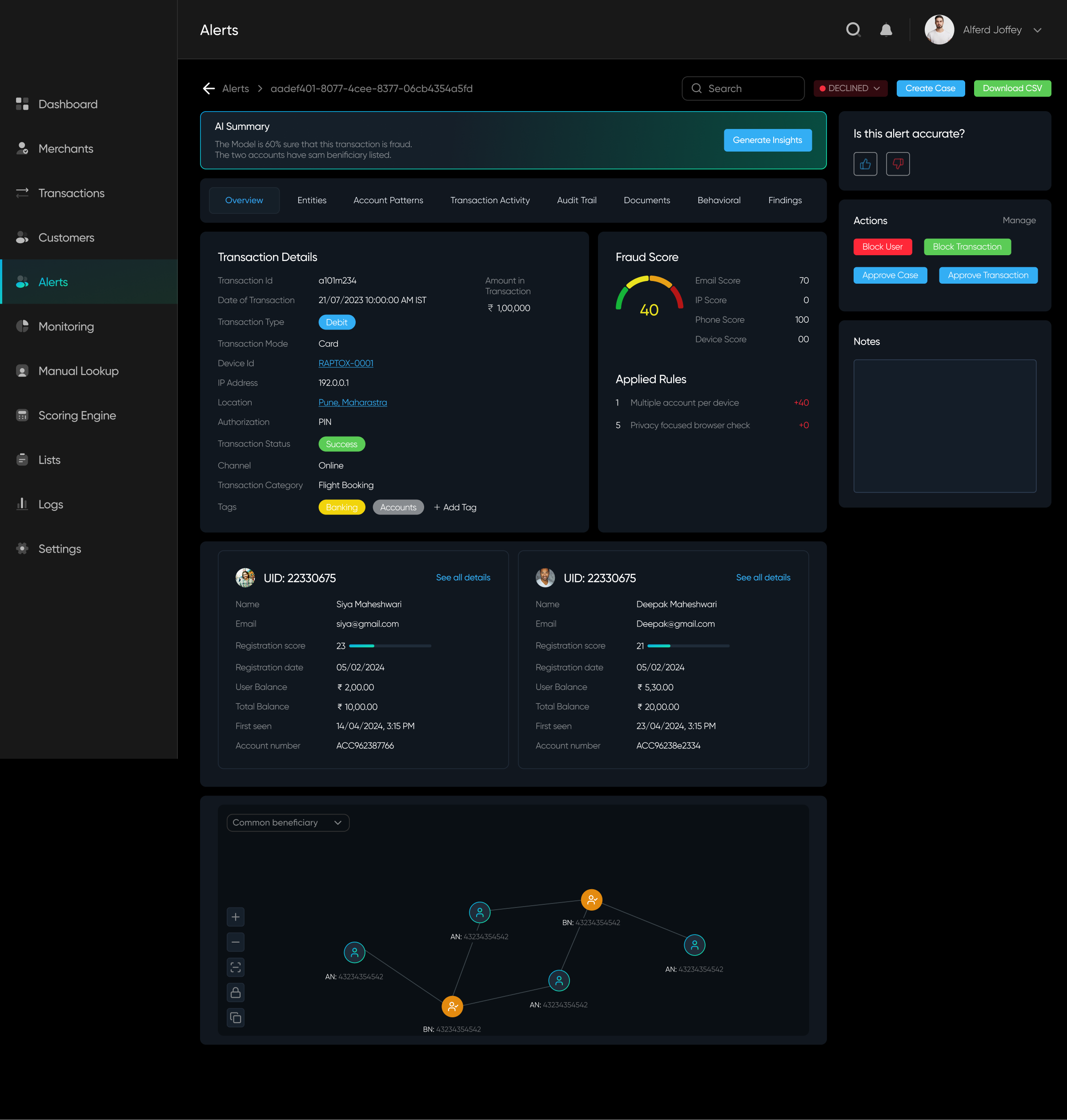
Through discussions and brainstorming with developers and stakeholders, we realized that minimizing data wasn't an option, as every detail was crucial. However, the development team was working on an algorithm that could consolidate multiple scores into a single compounded score, helping the system determine which information to prioritize and display.

After exploring multiple layouts, I worked closely with the team, iterating daily and gathering continuous feedback. The key questions driving our design decisions were:
Will analysts be able to find the data easily?
Will this help them resolve alerts faster?
What are the key insights analysts need to understand the data?
During these weeks of iteration, we also had to account for data variability—each case differed in complexity and size. Collaborating with developers to test promising designs was crucial to ensure scalability and effectiveness.
Option A
100%
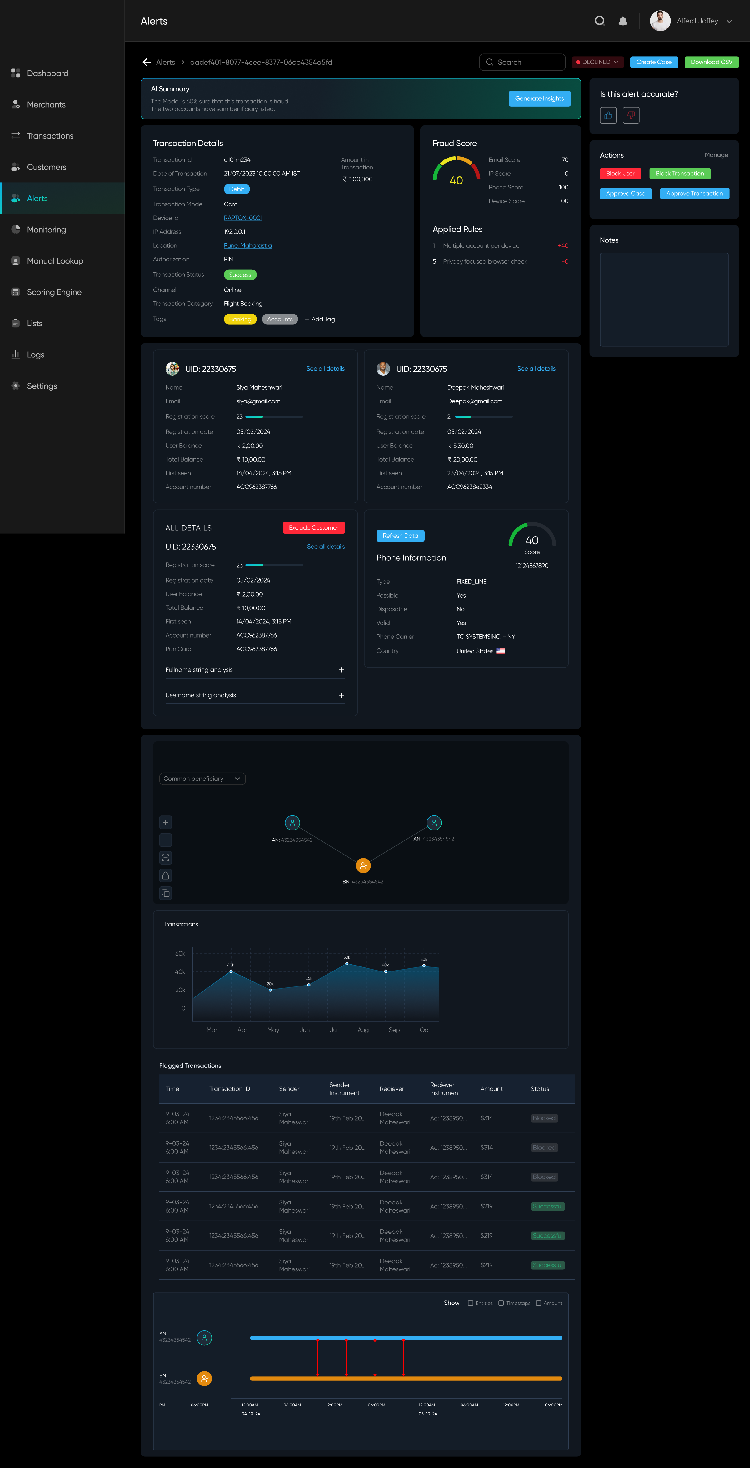
✅ Everything is accessible on scroll
✅ Right panel is for actions
❌ A lot of data without segregation
✅ Right panel is for actions
❌ A lot of data without segregation
Option B
100%
✅ Everything segregated under tabs and sub-tabs. Different groupings (based on relation) have different tabs
✅ Important data points on top
✅ Organised Panels
❌ Might get confused from the information architecture
✅ Important data points on top
✅ Organised Panels
❌ Might get confused from the information architecture
Option C
100%
✅ One navigation tab having clear structure of information
✅ Each tab has different motive and different data, avoiding ambiguity
❌ Each tab still has a lot of data without prioritization
✅ Each tab has different motive and different data, avoiding ambiguity
❌ Each tab still has a lot of data without prioritization
Post-Design
Analyzing the solution and implementing feedback
While testing internally, we found Option B more intuitive. We developed it, tested it on our database, and shipped it for our beta launch. The design improved user efficiency by 10%, but it still wasn't enough.
Beyond this, we received mixed feedback from both users and team members—some aspects worked well, while others needed improvement. To align everyone's understanding and address concerns, we conducted whiteboarding sessions to brainstorm solutions and refine our approach collaboratively.

Given our timeline for the next release, we prioritized key problems to address and focused our ideation efforts on solving them effectively.
Focused Identified Problems
Users struggled with complex cases due to the overwhelming amount of data to analyze.
Alert resolution was still time-consuming, impacting efficiency.
The available actions were too generic, providing little guidance for effective decision-making.
Alert resolution was still time-consuming, impacting efficiency.
The available actions were too generic, providing little guidance for effective decision-making.
Breakthrough in Tech, helping better Ideation
AI-driven insights for alerts are now more optimized, providing users with valuable guidance.
The risk score is now determined using a complex algorithm that identifies key patterns in alerts, helping prioritize and display the most critical data efficiently.
The risk score is now determined using a complex algorithm that identifies key patterns in alerts, helping prioritize and display the most critical data efficiently.
With major technological breakthroughs, new opportunities emerged for more tech-driven solutions, enabling us to address user feedback more effectively and refine our problem-solving approach.
Problem
Solution
A lot of data and Tabs
Improved risk scoring to enhance alert prioritization.
Reduced and restructured tabs for a more intuitive data organization.
Optimized data presentation for clearer and faster analysis.
Reduced and restructured tabs for a more intuitive data organization.
Optimized data presentation for clearer and faster analysis.
Always need to generate AI Insights
Backend optimizations allow us to surface generated insights upfront.
For lengthy insights, key data points are highlighted and linked to relevant patterns for better clarity and usability.
For lengthy insights, key data points are highlighted and linked to relevant patterns for better clarity and usability.
Generic Action panel
Introduced specific action suggestions based on AI-generated insights.
Implemented a way for users to take corrective actions if an alert was deemed inaccurate.
Implemented a way for users to take corrective actions if an alert was deemed inaccurate.
Guidance
Integrated a chat interface for seamless document uploads and collaboration.
Enabled analysts to discuss and resolve alerts together in real time.
Enabled analysts to discuss and resolve alerts together in real time.
Understanding these issues,
we tried to solve them
Here's how we tried to help the user:
- Gave them a clear overview of why and when this alert came up.
- A list of suggested actions to perform.
- A list of things they can visit in a certain order


Impact
The Results Are In – How We Made an Impact
With these refinements, the product became more robust, and its core features were now more intuitive. The result? We got the data from the product team that the Analysts could solve 60% more fraud scenarios than before in a day! Meanwhile, our dev team continued to refine AI-generated insights, making them even more accurate and valuable to users.


