DENTRIX
Reimagining the dentist workflow for attending patients
Dentrix has a large group of users, catering to x dentists, which includes y dental chains. With such a large user base, we wanted to make sure the experience is reinvented for the doctors, so they can have a smooth experience handling edge cases and generic workflows easily.
My Role
Lead UI UX Designer
Timeline
4 Months
Team
2 UI Designers, 1 PM
Initial Discovery
Context from Founder Discussion
After connecting with the founder, I gained clarity on the core objective of this exercise. The key insight was that doctors aren't utilizing the platform's existing features, tools specifically designed to streamline their workflows. The root causes are twofold: a lack of feature awareness among users, and outdated UI flows that fail to surface these capabilities effectively. The founder was looking for a fresh perspective to rethink these workflows from the ground up. Not just cosmetic improvements, but a fundamental re-evaluation of how doctors discover and engage with the tools available to them.
Research & Analysis
Taking a deeper dive
I decided to go with heuristic evaluation, user interviews, and unmoderated usability studies to understand the users' workflow and their pain points — but also to identify what they love about the process they follow today.
I picked a sample of 5 users.
I picked a sample of 5 users.
Findings from our research
We discussed whether to roll out in phases or do a complete revamp. During our discussion, the training aspect came up — users would have to go through training calls for setup, and a gradual rollout wouldn't work for their use case. So we summed up the problem statement.
Problem statement
This misalignment between system architecture and real-world workflow creates friction, slows down consultations, and increases the likelihood of missed information.
Here is how users use the platform...
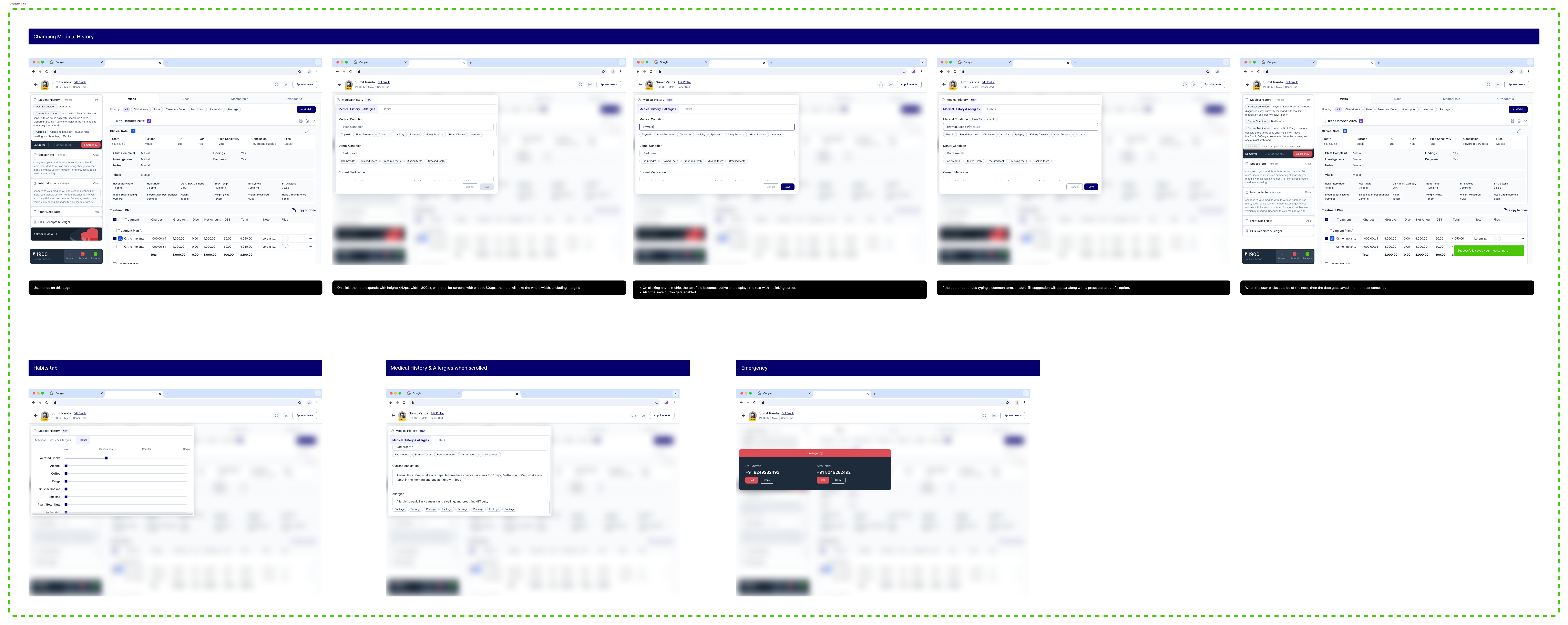
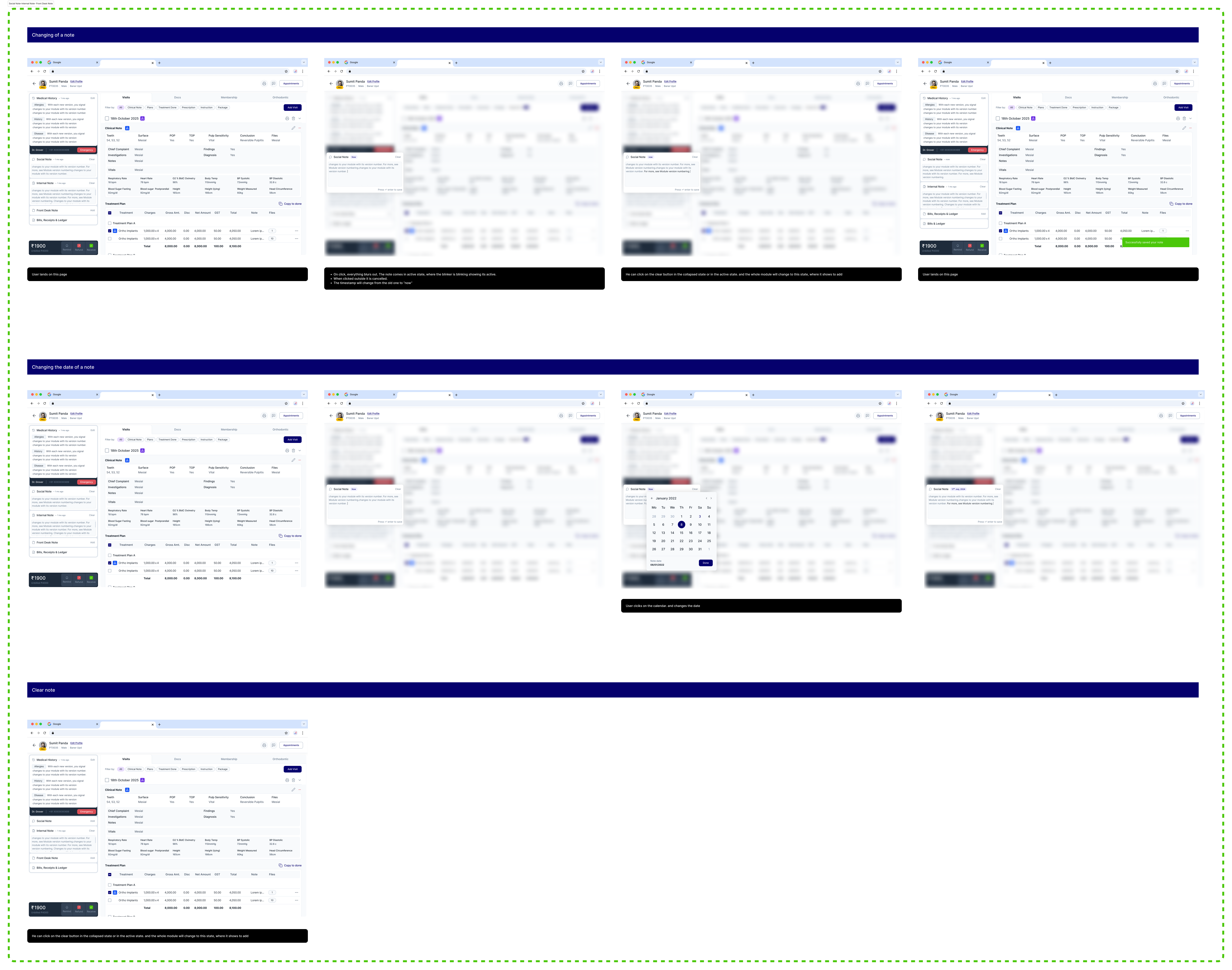
Sketching Ideas
Wireframing
I began wireframing module by module, using the process to clarify my thinking and iterate rapidly. Each round helped me discard weaker concepts and refine stronger ones, building toward a solid foundation before moving into higher fidelity work.
Drag to look around >>
100%
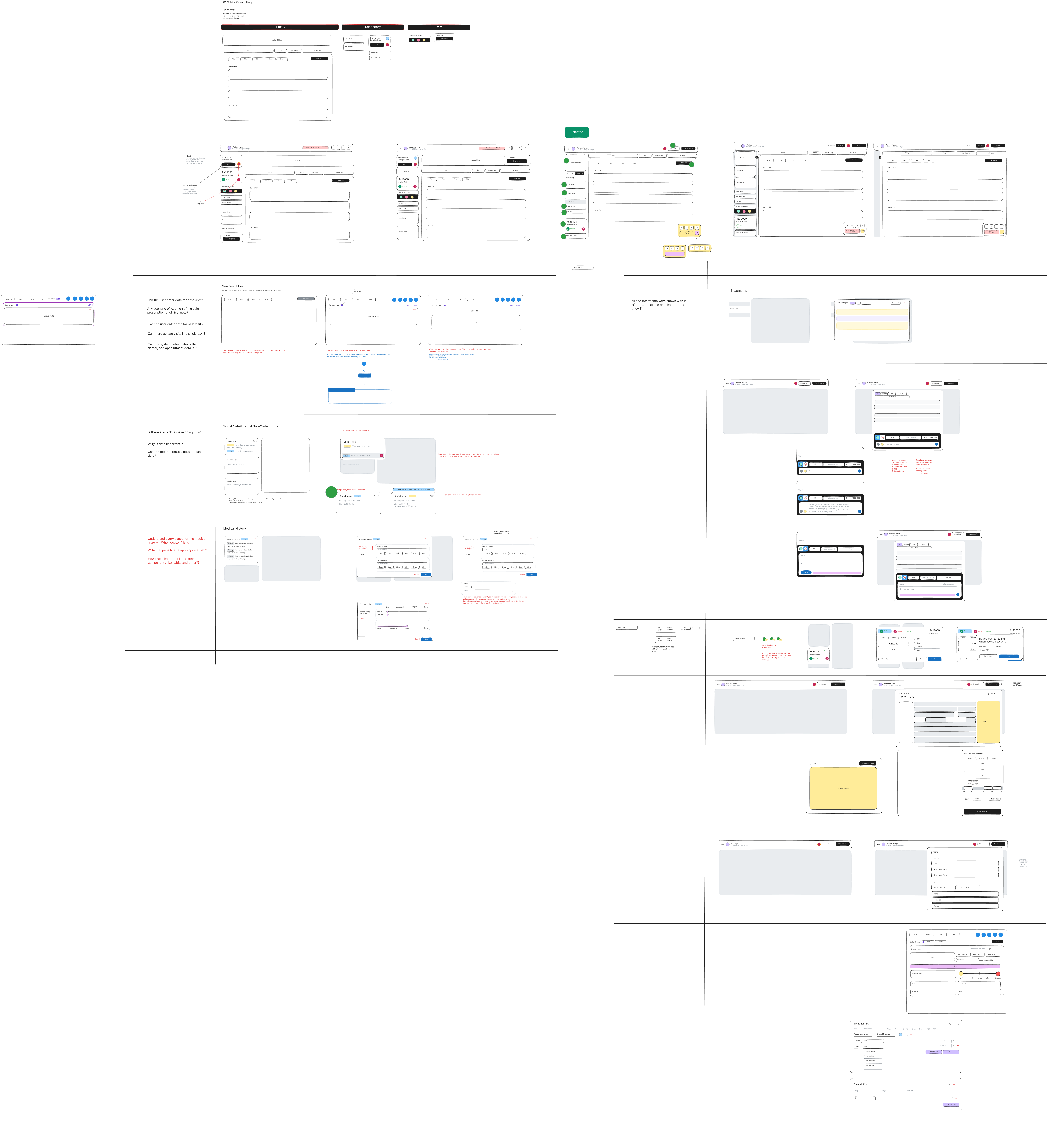
Revisiting Open Questions During Ideation
Designing solutions for the user pain points was an engaging exercise, but it also surfaced gaps in my understanding. I needed to circle back and validate whether all core functionalities and edge cases were accounted for before pushing the designs further.
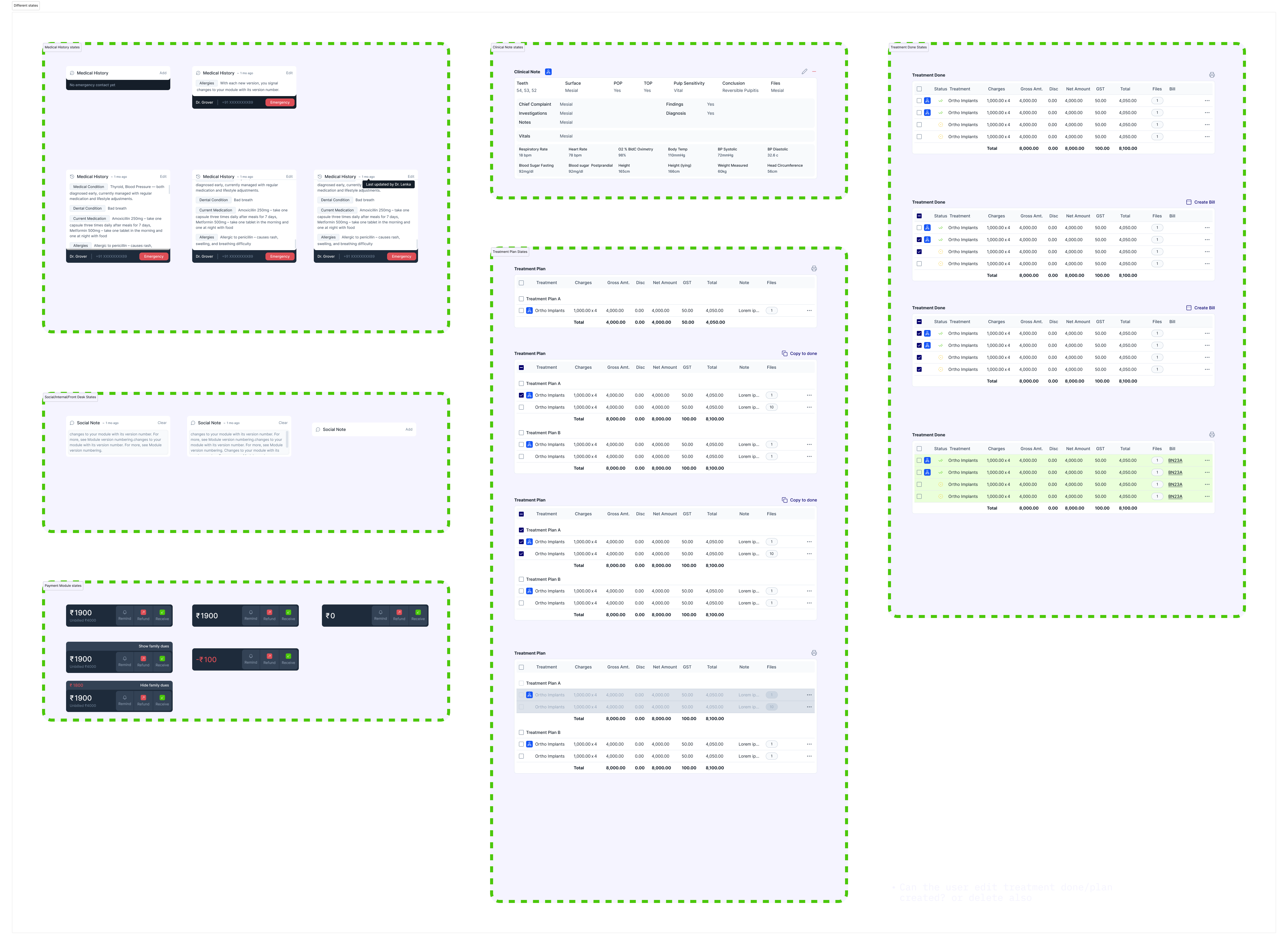
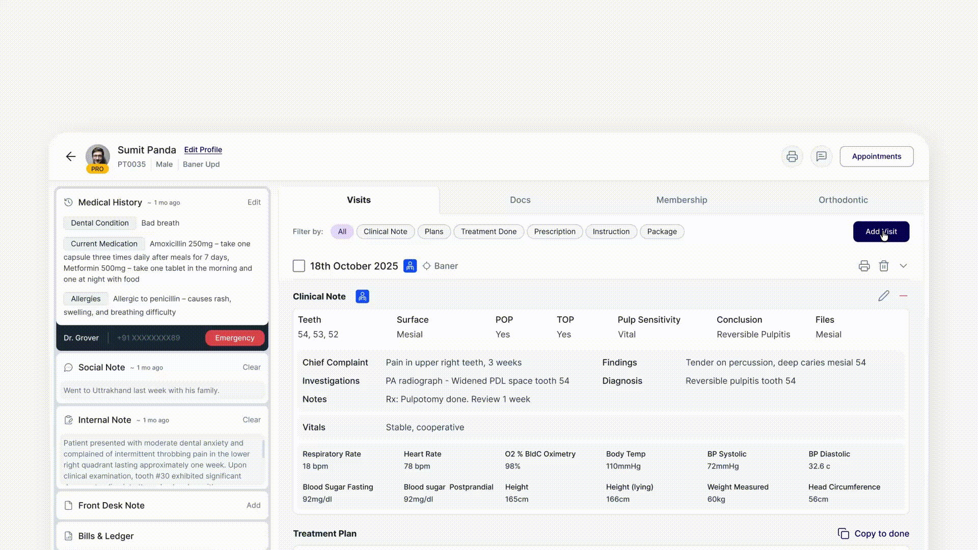
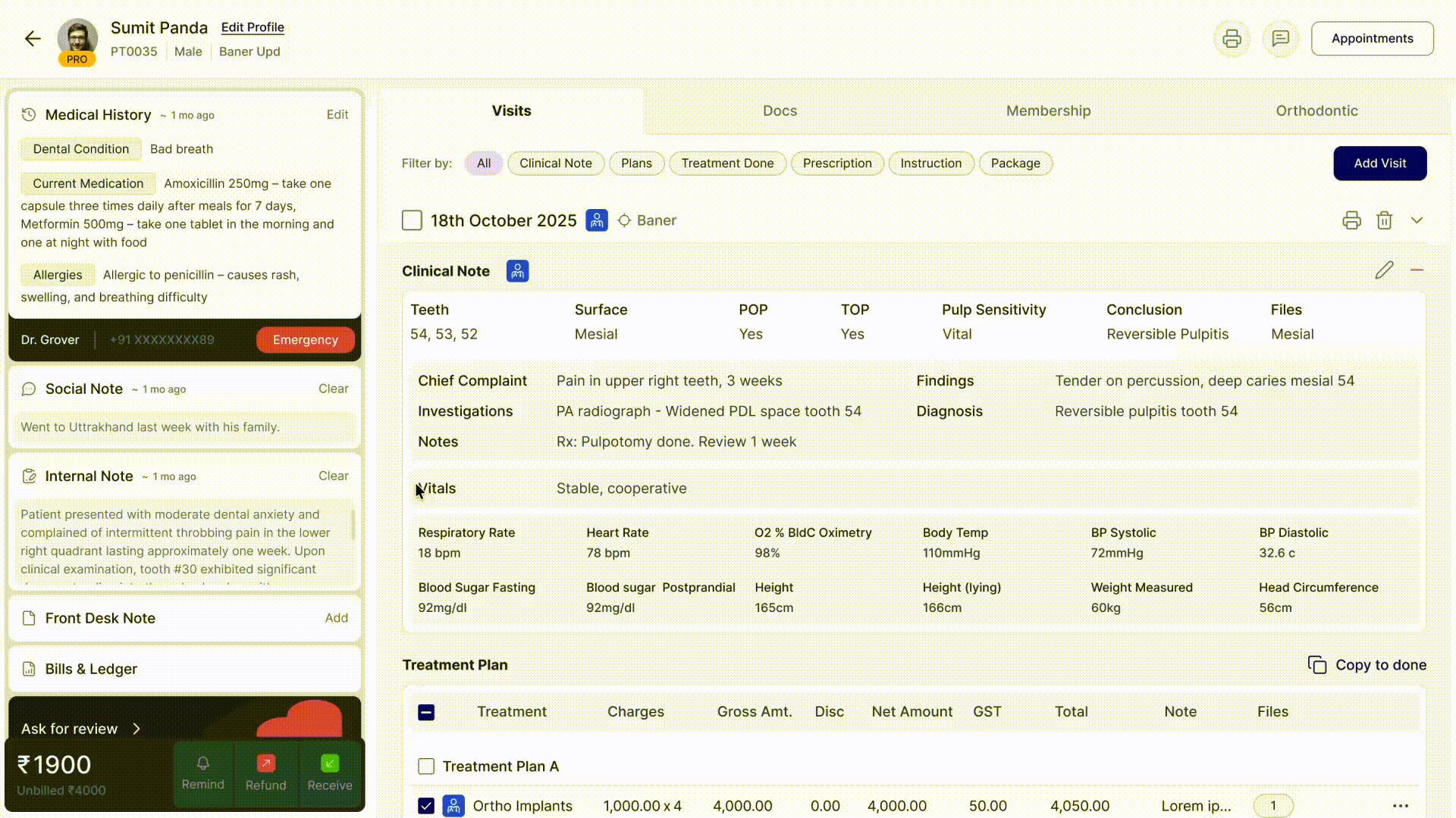
Crafting Hi-fi designs
Started with the layouts
module by module
We started exploring layouts, keeping in mind what the doctors are used to and what we can change.
Drag to see all modules >>
Drag to look around >>
100%
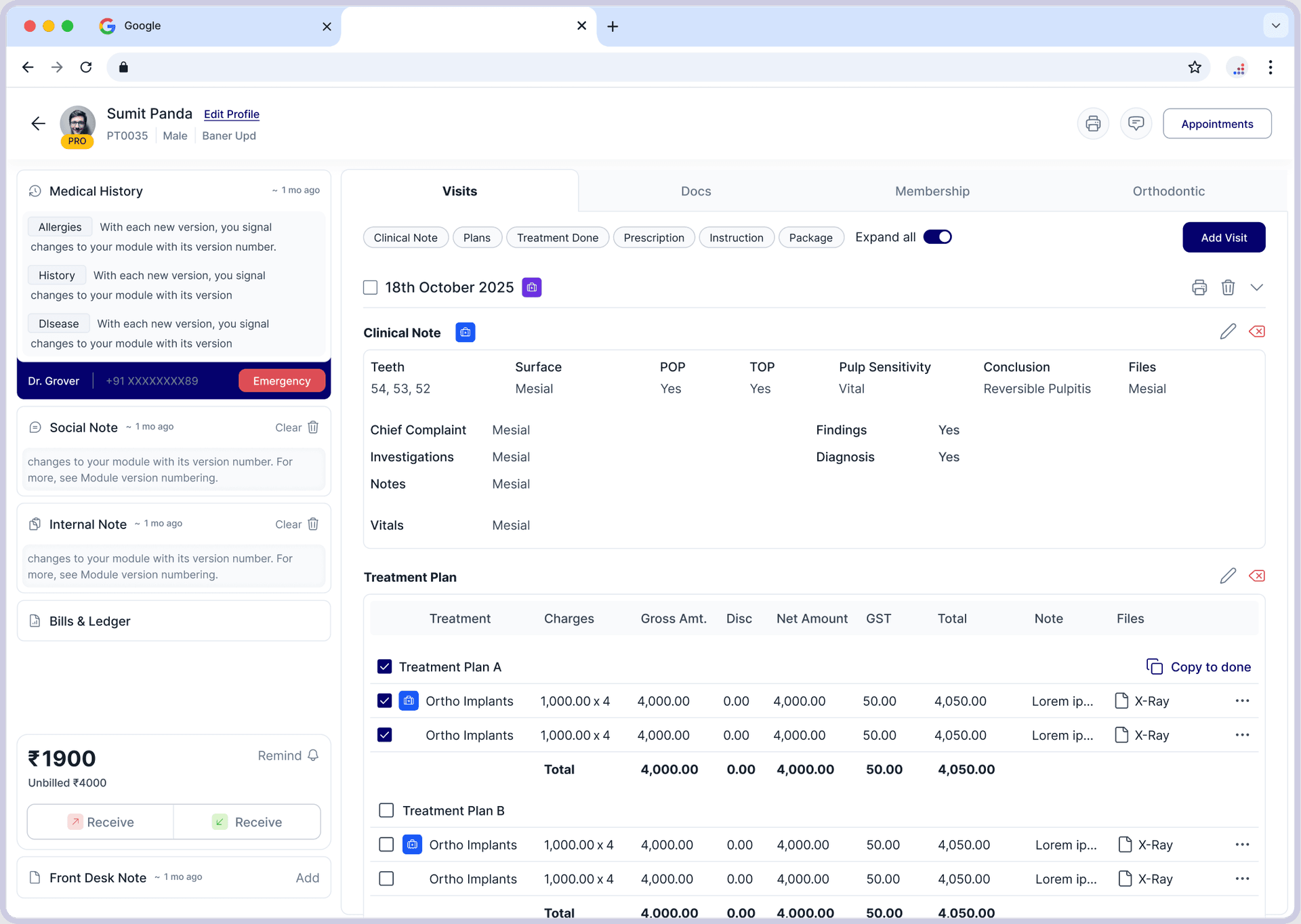
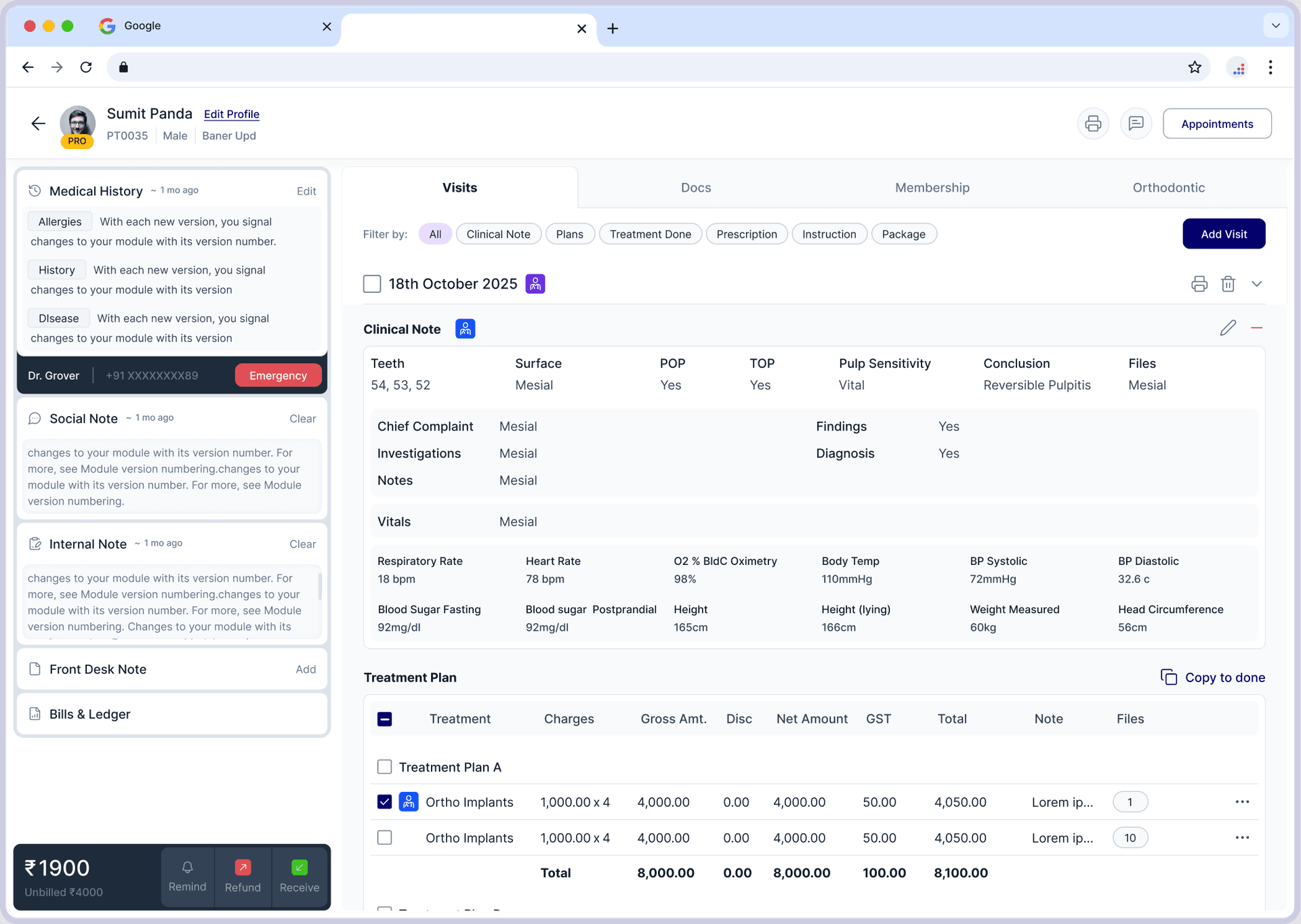
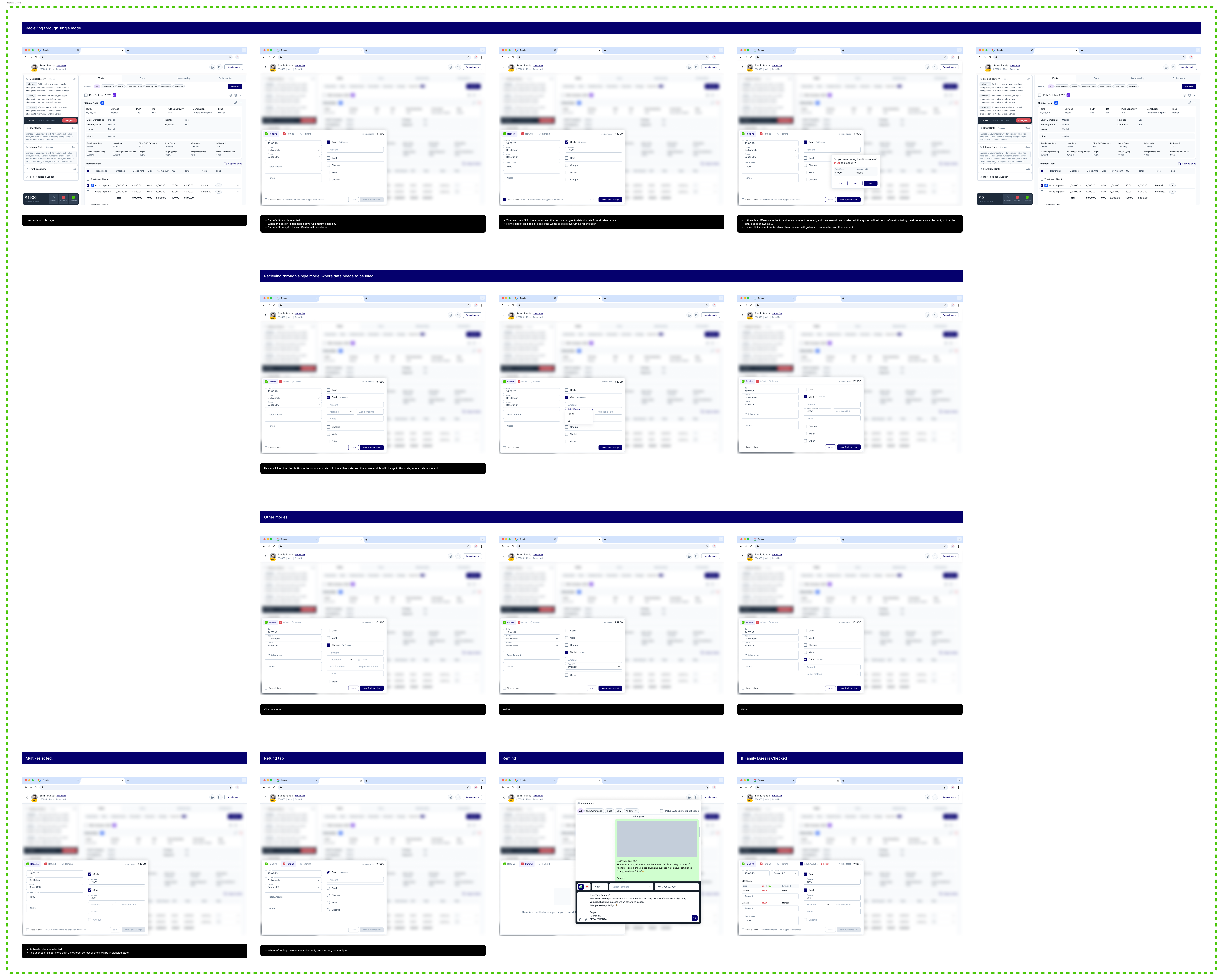
Final UI
Crafting the experience
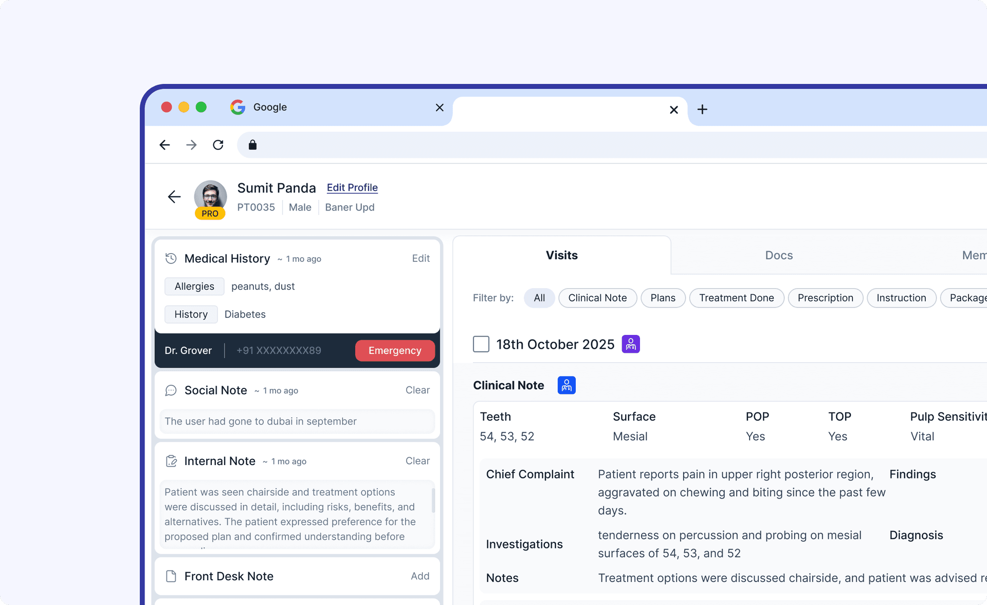
To understand the new experience, let's first see what the user is used to and how they were doing things earlier.
We came to understand how some components are connected to other components and flows. For example, if the user wants to print and send a document, where will they find it? Answering such questions helped us better understand the detailed flows.
Drag to look around >>
100%
Impact & Takeaways
Yet to be measured..
The development team is still working on getting this rolled out and tested. After the redesign, the company shifted their focus to something else, so the real impact is yet to come.


